 Listing pages are your e-commerce store’s “hub pages” or “money pages”. You list your products, categories, sub-categories, cities, services, etc.
There are two types listing pages:
Categories and sub-categories.
The Listing pages display a set of items in a grid form.
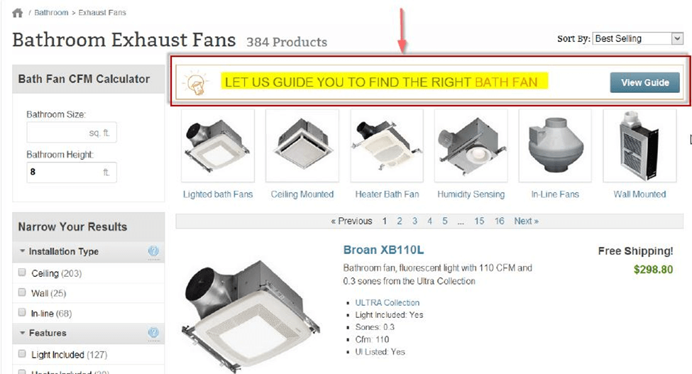
See below the screenshot of sub-categories of guitar on the Listing page.
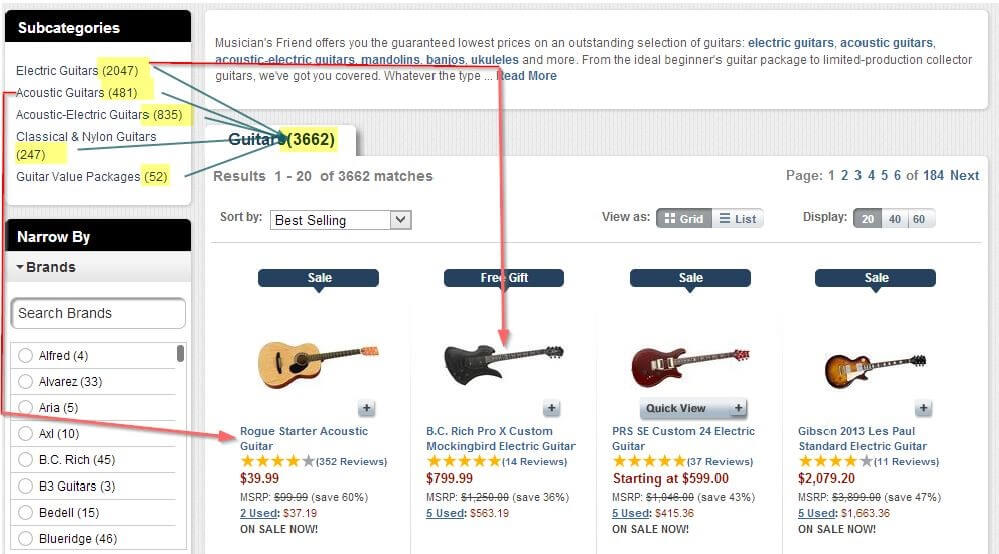 You can see the thumbnail images of the guitars in different sub-categories.
The problem here is that on a product listing page you find too many products or models to choose from.
It can give you a choice paralysis.
So what as an e-commerce store owner you can do in the Listing page area so that your customers do not suffer the same.
Here are 8 tips to follow:
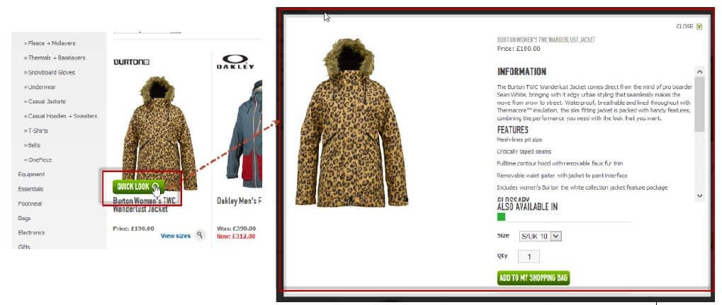
- Quick View/Look functionality
The quick look window feature magnifies and maximizes the content on the same page. I mean the listing page.
See below in the screenshot. Clicking the tab under the listed product opens a new window on the same page.
You see product description, features or benefits. You can even add that product to your shopping cart without leaving that page.
A great user experience feature!
From SEO perspective, it is also a win-win situation. The product on the listing page links with another super-relevant page.
The quick look window is a must-have feature on your listing page.
- Tweak Your Display algorithm
The search engines bring visitors to your category page. But they do not convert as much as you want.
What's wrong?
Maybe your categories listing pages fail to impress. You need to tweak them a bit or completely revamp them.
Collect all the vital stats of your bestseller products.
Put your profit-maximizing items on the first grid. They greet your visitors.
Remember the saying, “First Impression is the last impression”. That is true for the e-commerce world, too. Your online buyers are in a rush; they want to see your best at the first sight.
So tweak your display algorithm and make them happy.
They will make you happy too! - Add Category-relevant content at the Bottom of the Category/Sub-category page
Add super-relevant product content below the images in the category or sub-category pages. The images catch the attention. They encourage readers to scroll down to the rich product description.
Search engines also like unique, fresh and relevant content. Visitors find all the information in visual and text form right there in front of them.
See below the screenshot of LCD monitors. The images are on the top and relevant product description is at the bottom. Everything is on the same page.
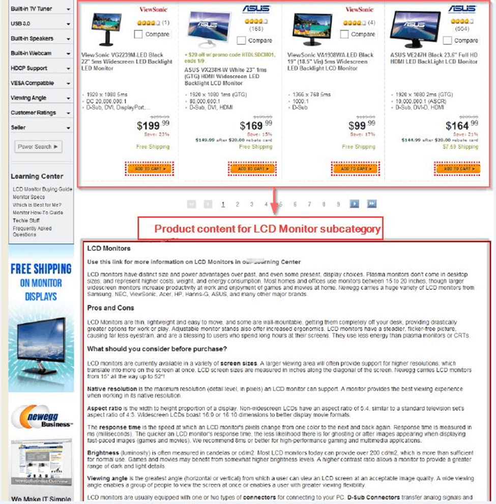 A convinced reader clicks the “add to cart button” to buy the product. That is a great usability feature.
Avoid placing the text (product description) over the images. It will be not that effective as the above-explained placement.
That is well explained in the following screenshot.
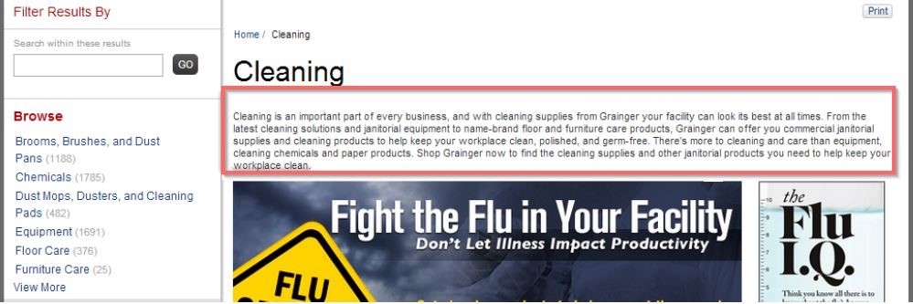
Provide a highlighted link to the content page to overcome space constraint. See below the screenshot.
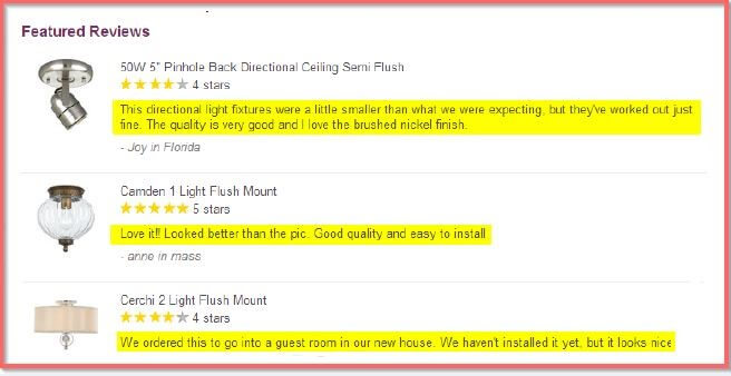
- User Generated Content
User generated content is invaluable. It adds fresh and relevant content on a regular pace. Search engines love that. Visitors love that too.
Do you not look into the customer testimonials before you make up your mind to buy that product?
Product reviews and Forum posts are examples of User-generated content. They influence visitors in a positive way.
See below, the product reviews related to different lighting fixtures.
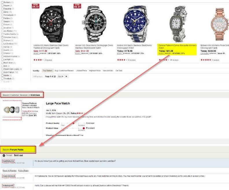
How about listing the forum post below the category pages? A great idea. See below in the screenshot.
- Prevent Content overload in product listing
If you have too many products to list you might end up committing the mistake of putting up too many products on one page.
Do not do it.
Too many products on the same page will only confuse your visitors.
It is content overload.
Do not do it.
If you have 50 products to show, divide them into a grid - 5 rows by 10 column. It makes your product listing page skimmable.
For hundreds and thousands of products, create sub-category listing.
If they are products of same categories it better you create sub-categories.
Chunk up your product listing pages. Make them readable. Make them look cool.
I talk more about it later in the blog (in tip no.8).
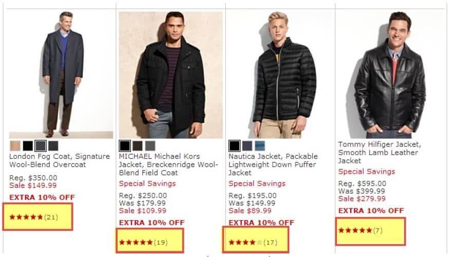
- Add Product reviews on Listing Page
Add product reviews on the product listing page.
The product-customer reviews with the five-star badge are a shot in the arm for your product.
They add a good impression and play a crucial part in speeding up the buying decision.
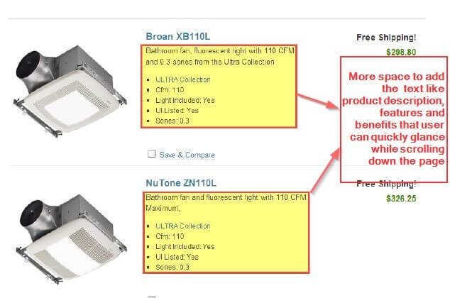
- Make list view the default view for listing page
The list view type arrangement allows more space for content.
You can see important and relevant content like features and benefits of the product at a glance.
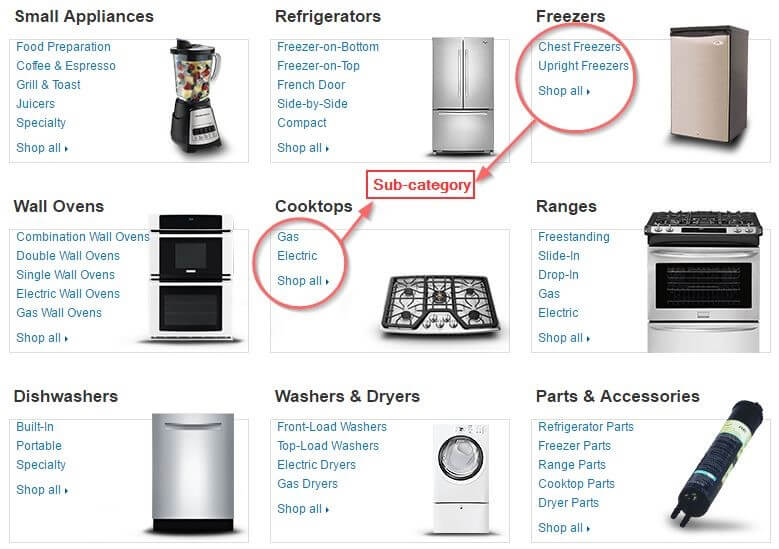
- List Sub-categories
List all your sub-categories like Amazon does. See below in the screenshot.
This type of listing gives exposure to all the sub-categories. They are easy to find and the products in them are one-click away.
Otherwise, they would remain hidden in complex navigation path.
This arrangement reduces clicks to the target and improves usability.
Conclusion
The 8 listing page tips help you magnify and maximize your product display. This, in turn, improves usability and influences the visitors to take a positive action.
